Companies pour significant time and energy into building reports, yet when a critical question surfaces in a board meeting, the answer is still somewhere in an outdated spreadsheet being frantically emailed around. By the time the file lands in the right inbox, the numbers are already a version behind.
This is not a failure of effort. It is a limitation of the tool.
Excel Built the Foundation
Before dismissing the humble spreadsheet, it is worth crediting what it actually did. For decades, Excel gave organisations their first real language for data, and that legacy deserves respect, not erasure. It democratised financial modelling, brought structure to chaotic information, and taught entire generations of professionals to think analytically in rows, columns, and formulas.
The challenge emerges not from Excel's weaknesses, but from organisational growth. When a company scales, the spreadsheet begins to strain under demands it was never designed to meet: consolidating inputs from multiple teams without version chaos, keeping data current without constant manual refreshing, and producing clean outputs for stakeholders who have no interest in opening a .xlsx file. This is the natural inflection point where dynamic dashboards enter the picture, not as a rebuke of Excel, but as its logical successor.
What Real-Time Reporting Actually Changes
A modern BI dashboard connects directly to live data sources and updates continuously, without human intervention. A CEO logging in on Monday morning sees the latest figures, not last Thursday's export. But speed is only part of the story. Clarity matters just as much.
A well-designed dashboard distils complex, multi-layered data into a visual narrative that a non-technical executive can interpret in seconds, no pivoting, no formula-tracing, no tab-switching. This is especially valuable as organisations serve a wider range of internal stakeholders. Finance teams may be comfortable interrogating raw data, but sales directors, operations managers, and board members typically are not. The advantages this unlocks are concrete:
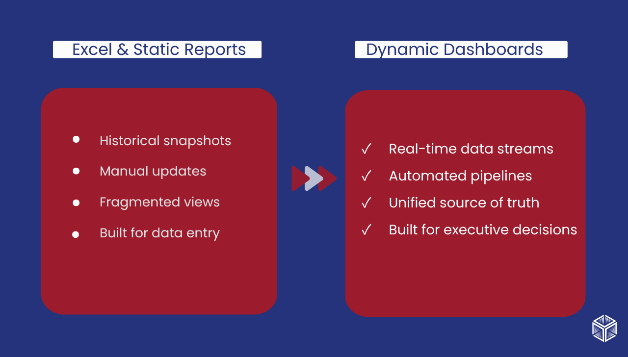
- Decisions are made on current data, not historical snapshots
- Non-technical stakeholders can read performance without needing data fluency
- The dashboard scales with the organisation, serving more internal clients without multiplying manual workload
Danaos Travel: From Data Fragmentation to Decision Clarity
Few industries juggle the operational complexity of tourism at scale. Danaos Travel, one of Greece's leading Destination Management Companies, manages incoming tourism, corporate travel, and tailor-made holiday packages across Greece and Cyprus coordinating accommodation, excursions, tour operators, and costs across multiple departments simultaneously.
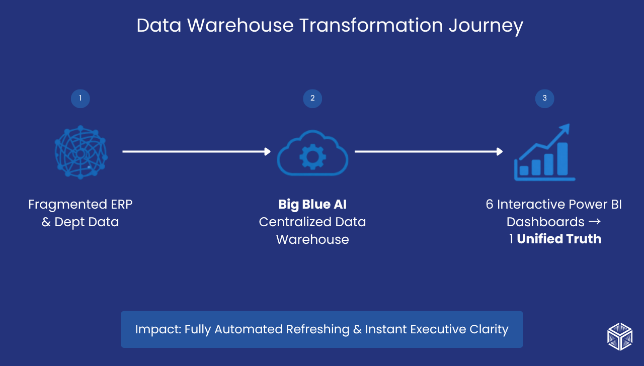
The challenge they faced will resonate with many growing organisations: each department operated from its own fragmented view of performance, reports were refreshed manually, and leadership lacked the real-time visibility to make confident strategic calls. The transformation, delivered by Big Blue AI, included a centralised Data Warehouse consolidating all critical data streams, automated daily pipelines pulling directly from the ERP system, and six interactive Power BI dashboards spanning strategic performance, accommodation, tour operators, and overhead costs.
The impact was immediate:
- 100% Automated Data Refreshing: Successfully automated daily data and report updates, drastically reducing manual labor and mitigating human error.
- Unified Source of Truth: Eliminated reporting inconsistencies by centralizing all critical data ecosystems into a cohesive and reliable Data Warehouse.
- Enhanced Decision Velocity: Empowered different teams with specialized insights which became an essential strategic tool.
- Upgraded Strategic Growth: Provided a multi-perspective analytical framework that radically upgraded how the business monitors costs, optimizes tour operators, and executes destination management.
Read the full Danaos Travel case study.
The Executive Advantage
For a CEO, the value of a dynamic dashboard is simple: less time chasing information, more time acting on it. When KPIs are visible at a glance and variances are flagged automatically, leadership conversations shift from "what happened?" to "what do we do about it?"
Excel gave companies their data literacy. Dashboards give them their data velocity. For organisations with the scale and ambition to compete in real time, the progression from one to the other is not a disruption, it is simply the next chapter.
Ready to move beyond static reports?
Big Blue AI helps organisations build the data infrastructure that turns real-time insight into real-world decisions. Talk to our team about what's possible for your business.


