Business intelligence (BI) is a powerful collection of tools and techniques that enable organizations to turn raw data into actionable insights. By helping businesses analyze data, identify trends, and make more informed decisions, BI has become a critical component of modern decision-making processes. (Ref) One of its most essential elements involves creating compelling data representations—visualizations and dashboards—that allow users across the organization to grasp vital information quickly and act on it confidently. In this article, we will explore the nature, significance, and best practices for leveraging visualizations and dashboards in the context of business intelligence, offering insights into how they can guide both technical and non-technical stakeholders toward data-driven success.
Introduction to Data Visualization and Dashboards
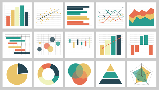
1. What are Visualizations?
A visualization is a graphical representation of data that conveys information more clearly and effectively than data in raw form. Often taking the shape of charts, graphs, maps, or other visual formats, visualizations allow users to see patterns, correlations, and anomalies at a glance. Presenting data visually is an effective way to distill complex information into a format that is more easily understood by a broader audience.
Importantly, the type of visualization chosen will depend on the nature of the data itself: bar charts tend to be most effective for categorical data, while line charts can show changes over time for continuous data. Maps, on the other hand, can be ideal for demonstrating geospatial patterns or regional distributions of a particular variable. A heat map enhances insight by color-coding data, making it easier to quickly identify losses across states compared to traditional chart analysis.
2. What are Dashboards?
A dashboard is, in many ways, a collection of individual visualizations arranged in a cohesive and interactive format that provides a holistic view of key data points. This integrated view allows decision-makers to quickly grasp the state of their business or an ongoing project by monitoring critical metrics side by side. Dashboards frequently highlight key performance indicators (KPIs), providing real-time or near real-time updates. They are often highly customizable, letting different stakeholders, from executives to analysts, see only the metrics that are most relevant to their roles. By combining multiple charts, graphs, and tables in one place, dashboards provide a seamless data exploration environment that encourages quick understanding, immediate insights, and timely decisions.
3. Brief History of Data Visualization
Data visualization has a rich and fascinating history that spans thousands of years. From ancient civilizations to modern times, humans have used various forms of visual representation to communicate information and tell stories. Here’s a brief overview of the major milestones in the history of data visualization:
Ancient Civilizations: The earliest known examples of data visualization date back to ancient civilizations, such as the Egyptians, Greeks, and Romans. They used visual representations like maps, charts, and diagrams to convey information about trade, population, and geography. These early visualizations laid the groundwork for more complex data visualization techniques.
17th and 18th Centuries: The development of statistical graphics began in the 17th and 18th centuries with the work of William Playfair, who is often credited with inventing the bar chart, line graph, and pie chart. Playfair’s innovations allowed for the visual representation of economic data, making it easier to understand and analyze trends and patterns.
19th and 20th Centuries: The Industrial Revolution and the rise of modern statistics led to the development of new data visualization techniques, such as the histogram and the scatter plot. The work of pioneers like Florence Nightingale and John Snow also showcased the power of data visualization in public health and epidemiology. Nightingale’s polar area diagram and Snow’s cholera map are prime examples of how visualizations can drive impactful insights and actions. (Ref)
21st Century: The advent of computer technology and the internet has revolutionized data visualization, making it possible to create interactive, dynamic, and immersive visualizations. Modern data visualization tools and software have democratized access to data visualization, enabling anyone to create and share visualizations. Tools like Tableau, Power BI, and open-source options have made it easier to transform data into visually appealing and insightful visualizations.
Why Are Visualizations and Dashboards Important in Business Intelligence?
1. Simplifying Complex Data
Modern organizations generate vast amounts of data, often from numerous unconnected sources such as transactional databases, enterprise resource planning (ERP) systems, or social media platforms. Making sense of this sea of information can be daunting, especially when the data arrives in disparate structures. Visualizations and dashboards offer a way to unify these different datasets in a single interface and display them in an interpretable, digestible format. Rather than parsing through thousands (or even millions) of rows in a spreadsheet, users can quickly analyze multi-dimensional data presented visually, identify trends, and make faster, evidence-based decisions. By visualizing the edges between nodes in network graphs, users can better understand connections and influences within the data.
2. Facilitating Data-Driven Insights
Business intelligence is about enabling data-driven insights that prompt strategic actions. The effect of certain events on data trends can significantly influence these insights. When merged with visualizations, BI offers more than just raw metrics—it provides context. Visual dashboards showcase relationships among variables or over time, allowing decision-makers to see how certain KPIs behave in relation to external events, comparisons, or historical benchmarks. The interactive features of dashboards can compel users to dig deeper into anomalies or outliers, thereby uncovering untapped opportunities or diagnosing underlying problems. For instance, if an executive notices that sales in a particular region have dipped for two consecutive quarters, they might drill down into the dashboard to investigate product categories, local trends, or marketing campaigns that could explain the decline.
3. Communicating Effectively With Stakeholders
Not every stakeholder in a company has the same technical skill set or data literacy. Whereas data scientists and analysts may be comfortable with SQL queries, statistical models, and data mining, sales teams, marketing executives, and senior management often need more straightforward representations to make informed decisions, Visualizations and dashboards bridge the gap by exporting complex analytical findings into captivating visuals that those without a deep technical background can understand. Charts, graphs, and color-coded indicators allow for quick scanning and comprehension, enhancing collaboration across departments. This shared visibility helps foster a more cohesive, data-centric culture.
4. Monitoring and Tracking Performance
Over time, the ability to measure performance is integral to continuous improvement. Through dashboards, organizations can monitor key performance indicators over any desired timeframe, whether daily, weekly, monthly, or quarterly. Fluctuations in metrics like sales growth, customer acquisition costs, click-through rates, or inventory turnover become more apparent when viewed side by side in a dashboard than by analyzing separate reports. This continual performance monitoring can highlight inefficiencies, guide process optimization, and mobilize teams to propel the organization toward its strategic goals. Moreover, real-time dashboards are invaluable for quick reaction in dynamic markets, where timely interventions can be decisive in maintaining a competitive advantage.
Conclusion
As organizations continue to generate vast amounts of data, the power of visualizations and dashboards to translate complexity into accessible, action-oriented insights remains a cornerstone of business intelligence. By presenting real-time metrics, uncovering hidden trends, and fostering a data-driven culture, these tools enable decision-makers at every level, from executives to frontline staff, to make informed choices quickly and confidently.
Ultimately, the judicious use of charts, graphs, interactive elements, and thoughtful design empowers teams to clarify objectives, streamline operations, and maintain a competitive edge in rapidly evolving markets.


